Two of the most important aspects of any website are traffic and conversions. If either one of them takes a slump, it becomes very difficult to recover from it.
User Experience (UX) of a website is responsible for conversions. If visitors to your site find it difficult to navigate, don’t find it trustworthy or are unhappy with the effort put into building the site, they will eventually leave and you will lose out on a conversion.
Here are some stats to prove this point further-
- Assuming the time spent by users on the website as 15 minutes, two-thirds of people would read something that is visually appealing over something plain.
- 38% of people will leave the website if the content/layout is unattractive.
- 44% of website visitors will leave a company’s website if there’s no contact information or phone number.
- 86% of visitors want to see information about a company’s products/services on their website’s homepage.
- On reaching a company’s website via a referral site, 36% of visitors will click on the company’s logo to navigate to the homepage.
On other hand, you can get traffic from anywhere, with Google being one of the obvious choices (this is where SEO comes into play). You can also source traffic via other channels like paid advertisements, Social media promotion or simple word-of-mouth doing the trick. But in the long run, we all know that search engines are the ultimate source of getting traffic to your website.
Now, some would say user experience is more important than SEO, well because IT IS.
At the end of the day, SEO is getting you the traffic (Yes! It’s very important) but user experience is what will eventually convince customers and drive conversions.
1. PERSONALIZED CONTENT:
When you write your message more appropriate words required for your customers, they can automatically relate to it; that’s because it resonates with them and thus, one cannot simply describe how much of an impact this little (Little? Ask content writers about that) tweak alone can make to your conversions. Customers have a much higher regard for a company that delivers custom content.
‘Higher regard’ means they trust the brand more and therefore are more likely to buy from them.It eliminates the friction and instead welcomes them.
2. USE CTA’s BUT IN STYLE:
Nobody likes to be bogged down with Call-to-Actions, and nobody likes to go on a journey to find them either. CTA buttons have a huge part to play in driving conversions. Forget about the placement or the size of text on it, sometimes even a change of color can result in increased conversions.
Let’s take a look at the following examples:
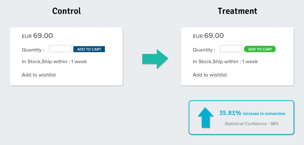
A major European e-commerce store increased their CTR and Sales by 35.81% by simply changing the color of the button from blue to green.
Next,
Performable tested their homepage with two buttons: One was green and the other one was red. They kept the text same (Get Started Now!)
The result, the red button saw a higher CTR by 21% than the green one.

Apart from the color, placement and copy of a CTA button can also play a huge role in converting an interested party.
Placement of the CTA button obviously depends on the site designer, but more often than not, the underlying basic principle would say that you not required here place it where a customer is most likely to look for. When you step into a customer’s shoes and buffer though your landing page, it is then when you realize that you need a CTA button. The ideal place would be to place it at the start and make sure the users are able to see it so that when they are done, they’ll know where to find it.
Next up is the copy of the CTA button. It’s very important that you have a compelling copy for the CTA button.Think about it; you put your heart into designing the site, publishing top-notch content and doing almost everything right but it’s the text on the CTA button that changes everything when it comes to satisfying the customers.
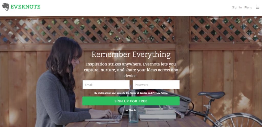
Here’s a great example:
“Remember Everything”- simple and yet convincing enough.
3. Navigation:
Almost every website has some sort of navigation but not every website’s navigation is good or free-flowing.Navigation of a website often determines whether it is a deal or a no-deal. Here’s how you can improve a site’s navigation:
- Consistency – Always follow the same basic layout on your website all the way until the checkout page. This way, it is easier for the user to find relevant information on the website.
- Dividing up the categories clearly – The bigger the website, the more difficult it can get for the user to navigate. Keep it clean and organized by dividing the content into different categories, all within a click of the user.
- Accurate Navigation Titles – It’s very important that the titles are clearly defined. They should provide the users with a general idea of what they might find on the next page before clicking the navigational link.
- Clickability – Consider this- you visit a website, click on a page and then click on another page but then you want to go back to the first page again. You can see the navigational elements but they aren’t clickable.This can get quite annoying. So make sure all the navigational elements are clickable.
- Search Toggle – It is highly recommended that you add a search toggle on the site as this directly results into conversions. Quite often, users don’t find it too comfortable if it keeps popping up everywhere on the website. Keep the search bar integrated with the website, but place it at a convenient location so a viewer doesn’t see it as a disturbance while browsing the site.
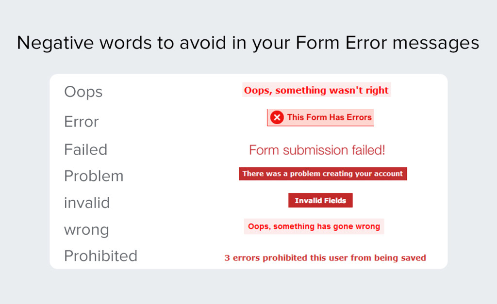
4. Page Error Message: Any person on the face of the earth would be annoyed if he/she clicks on a link to a website and it leads nowhere (Hell, even crawlers don’t like that and they are ROBOTS!).
But we are humans and humans make mistakes. It’s good that we have been taught to quickly apologize for it. When any of the errors ‘pops’ in your website, displaying a personalized and a friendly error message is the best way to go. This way, the user is likely to stick around and take another spin on that form or checkout page.
5. Visuals: Words may rule the web but it is strong visual components on your site that will eventually engage your users and convert them.Everyone knows that photos and visuals are more appealing to our brain. Hence visuals are of great importance, and should be used wherever necessary.
Renowned Scientific Advertising prodigy Claude Hopkins asserts that “Images should only be used when they create a more persuasive argument than the one crafted with words.”
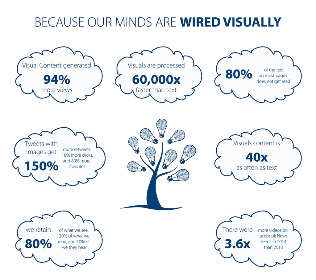
Not only good visuals boost the credibility of a website, but they also create an emotional connection with the user.
6. Social Sharing Buttons: It will be very difficult to find any website or e-commerce product page today without those social sharing buttons, because they help boost the number of visitors. It gives the user a chance to share your webpage on social networks. Almost everybody who is using the internet today has an account on at least one of the popular social media sites. This can dramatically increase traffic to your website and boost your brand engagement, which in turn will increase the chances for conversion.
Conclusion: Summing it all up, there are a lot more ways by which you can make changes to your website, but the ones mentioned above are sure-shot tweaks to increase the rate of conversion of your website.So, don’t hesitate to experiment with these little tweaks and redesign the user experience to attract more viewers and your conversions are sure to go up!

